Our 2017 Google Ads Management guru gave us his experience with Google Ads Interface and Ben has updated the article with 2024 insights.
The New Google Ads Interface: 2024 Update – Why It’s Still a Challenge
By now, most of us in the digital advertising world have been forced to adapt to yet another update to the Google Ads platform (formerly AdWords). If you’ve been around for a while, you might even feel like we’re entering the realm of AdWords Interface version 5.0. And if you’re working in an agency, you’ve probably wished that they’d given us the courtesy of a “Revert to previous version” button like they did back in 2017 when AdWords Express 2.0 came out.
If you’re like me — a digital marketer who’s been using this platform for years — you might not be too thrilled about this latest round of changes to the new Google Ads interface.
Why the Change Isn’t the Problem (But Also, It Is)
Let’s be clear: it’s not that I don’t like change. I get it — tech evolves, and staying stagnant in the digital space is a death sentence. But this latest new AdWords interface (yes, I still sometimes call it AdWords) presents a host of problems beyond simple adaptation.
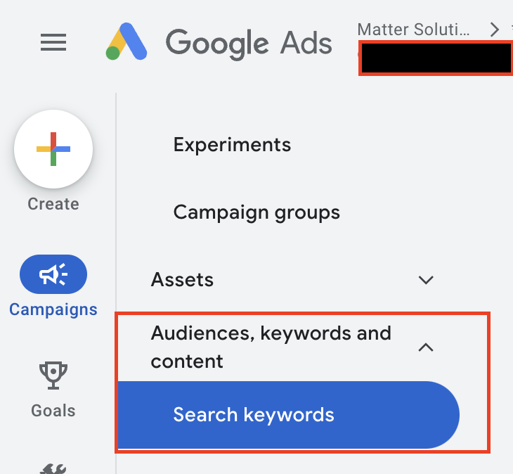
It’s not just that features seem hidden, although they often are, I mean, why separate the Search Term Report from the Keywords? Huh? HUH? Are you trying to make it harder to analyze the data and make changes so people become dependent on your AI? We know the answer. Why is this:
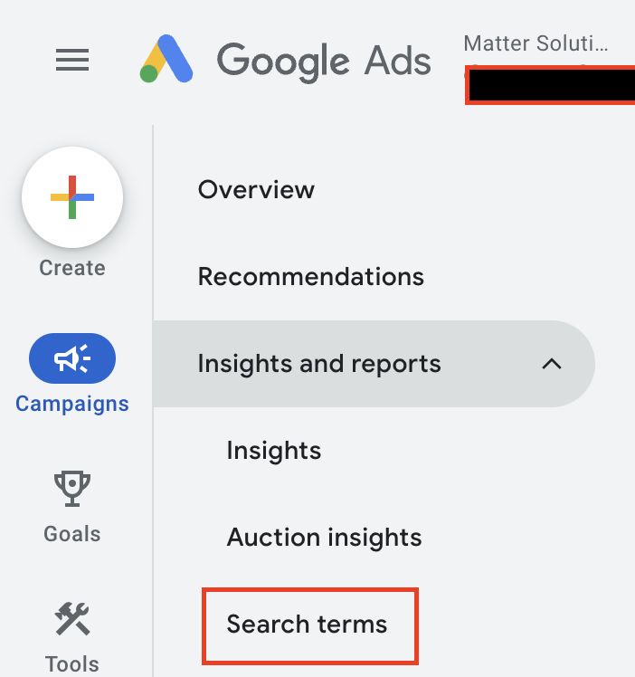
So far away from this:
It’s not even the emphasis on aesthetic polish over usability. What irks me most is how disorienting the new Google Ads interface feels, again, for those of us who once navigated the platform with our eyes closed.
From Seamless to Stumbling
I used to be able to talk a client through their account blindfolded. Whether it was finding billing, adjusting mobile bid modifiers, or setting up click-to-call ads, I could guide them over the phone without even looking at the screen. It was muscle memory from the biggest muscle in my body. My tongue. You thought I was going to say brain, didn’t you!
Then came the new Google Ads interface. Suddenly, my time on calls with clients doubled. Not only did I have to spend time explaining what the client was seeing, but I also had to figure out where some of the data had moved while I was on the phone, making me sometimes look like I’m stumbling and don’t know what I am doing.
Why move the Campaign Settings tab from the main menu and stick it in that weird place below the dates, Google? Is it to make me look like I don’t know what I’m doing?
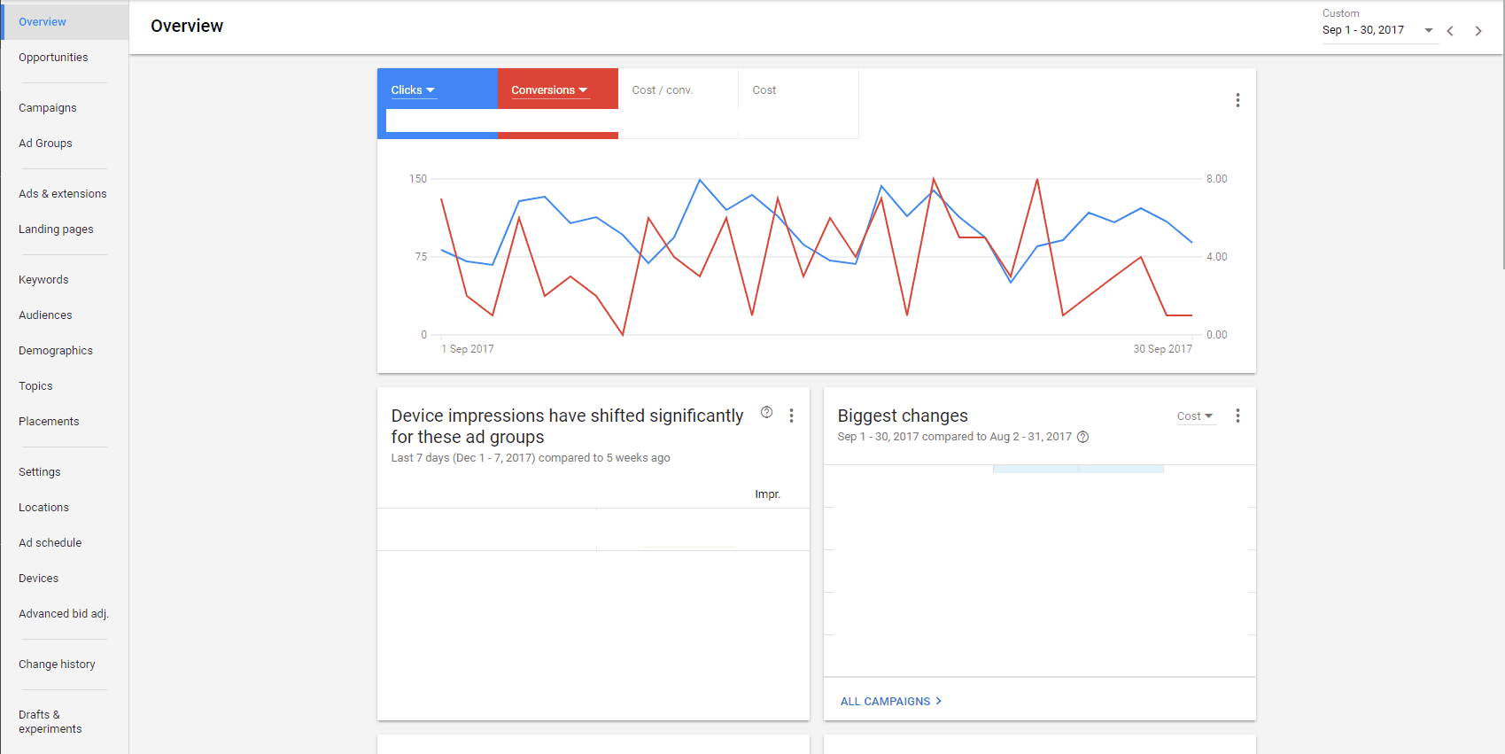
And why, in the time it took writing this article did you move it from here:
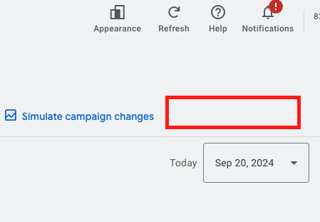
To here:
Admittedly, these are minor gripes. The real problem is the complete shift in layout. Tabs that were once conveniently located across the top for Ad Groups, Keywords, and Ads are now buried in vertical menus. The natural flow that allowed me to navigate like a stenographer — typing and clicking in seamless motion — is gone. Now, it takes two or three extra clicks to get to the same place.
Like Moving from Feet and Inches to Millimetres
I know it sounds dramatic, but this change reminds me of when we switched from imperial to metric measurements. Imagine being a carpenter for 10 years and suddenly having to read blueprints in millimetres. Now, I was never a carpenter, nor was I around in the Dark Ages (or whenever the metric system was implemented), but that’s what this feels like — a complete overhaul of a system that I’d mastered, then re-mastered, then mastered again.
Why the New Interface Isn’t All Bad (for New Users)
Here’s the kicker: while the new AdWords interface frustrates seasoned pros, new clients actually seem to like it. It directs them down the easy path of creating Ads through using Smart Campaigns and assuring them that all is well, Google will look after them, no need to worry, your Advertising is in great hands… wait a minute, are you being hypnotised by Google? Remember, Google works for Google! Not you, they want your money!! Avoid giving it to them.
The new Google Ads interface is designed to appeal to small business owners and newcomers, offering a quick and easy way to “get seen on Google”. The Smart Campaign’s dashboard gives users bite-sized, digestible data, and is touted as using Google’s sophisticated AI.
Will It Affect Agencies? Not Really
You might be wondering if the new AdWords interface will make it easier for clients to manage their own accounts, effectively cutting agencies out of the picture. I’m not worried about that. In fact, it’s the opposite. Having a dashboard with simplified data points makes it easier for me to explain results and strategies to clients with more in depth data in the back end of the Campaigns, or through Google Analytics. This can strengthen client relationships when they realize that the “oh so simple” facade of Smart Campaigns is a ruse by Google to separate them from their money, and that I am here to stop them, like a .
This isn’t a threat to agency work; it’s just another evolution of the tools we use to serve our clients better.
The Grumpy Marketer in Me Still Isn’t Convinced
For now, I’ll continue to grumble about the Google Ads interface. I’ll adapt, as I always have. And, like every other time Google has rolled out a major change, I’ll eventually get used to the new system. But until then, you’ll find me muttering about how things were better before. Because, let’s face it, we all have a little “grumpy old marketer” in us when it comes to drastic platform overhauls.
In the meantime, I’ll keep honing my skills in this updated world of Google Ads so that when they inevitably lock us into the new interface for good, I’ll be able to navigate it with the speed and precision of a hacker from a 90s movie.
Original 2017 version
We’ve all used the New AdWords Beta interface by now, or as I like to call it, AdWords Express 2.0 because I like using outdated tech references. If you’re in an agency, you’ve probably reverted to the previous iteration on more than one occasion.
If you’re in an agency and you’re like me, you despise the new interface.
It’s not that I don’t like change. If I didn’t like change, I’d be in the entirely wrong industry. It’s not that the functionality is limited, although it actually is, albeit an issue that is either being rectified or has been rectified. It’s not even that it appears to focus on visual and aesthetic appeal over substance while shifting the “wireframe” structure from horizontal to vertical.
I don’t like it because I knew where everything was with my eyes closed. I’d literally be able to assist clients on how to navigate their account while I was on the road speaking on my mobile. Everything from Billing to Mobile Click To Calls, to you name it and I wouldn’t even need a screen in front of me to get there. And for such a go-getting, man-about-town like myself, this was a great benefit.
When the new interface came through I doubled the time I was spending on the phone due to having to firstly decipher a client’s understanding of what was on the screen, then determine if it is Beta or the previous iteration that they are viewing. Further to that, in the beginning, the Settings link was three black dots that was difficult to see in the top right-hand corner of the screen, they’ve since changed this to a spanner, which is, ahh, like, okay? I mean, why not just keep it a cog/wheel?
Anyway, that seems like a pretty petty reason to dislike the Beta rollout, I admit. It’s also the fact that the color scheme sucks, there has been a dramatic change from having the tabs for AdGroups, Ads, Keywords, etc. These tabs were previously horizontal across the top but are now vertical, with a variety of other details that are there, but not where they were before, so where I used to be able to glide across the keyboard and click the mouse so it sounds like a courtroom stenographer, I have to click two or three things to find it.
I’m going to make a grandiose and probably entirely inappropriate comparison, but I imagine it to be similar to when we moved from imperial to metric, and I was a 5+ year carpenter accustomed to feet and inches, and the architect started sending plans in millimetres.
That’s why I don’t like it.
But new clients like it. That’s why I call it AdWords Express 2.0, it shows a lot of the information that a business owner appreciates on the opening dashboard. It explains, to a degree, what the data is as well, something that was missing in the impersonal data structure presented in the previous AdWords.
I’m not concerned that it will make it easier for my clients to manage their account themselves, or harder for me to obtain new clients. On the contrary, it will assist me to obtain and maintain my client partnerships. I’ve always been an open book with my clients and the strategies that I employ, it wasn’t the strategy that was the issue, it was the representation of the results that was difficult to communicate.
A client can see relatively easily on their dashboard the Search Terms that are coming through, we can personalise their dashboard with bite-sized snippets of information that they want and need.
I’ll probably keep using the old interface for as long as possible, and slowly begin to move to the new interface in order to ensure that, when they do pull the trigger on making Beta the real and only deal, my navigation skills resemble a hacker in any 90s movie. Until then, I reserve the right to be a grumpy old man.
Need help with your digital marketing?
Book a free strategy call and let's discuss your goals.
Book a Strategy Call